Typography basics in three lessons with short homework tasks. To refresh knowledge or to catch up.
Lesson 1: see
Format
The first decision to make is the choice of format. It should be determined by the intended use; the format itself communicates. It shapes handling and readability.
The choice may also be limited by external conditions, such as standard sizes or economic efficiency. If a format does not follow a standard size, more material is cut away and waste is produced.
Pages
The number of pages is not only an editorial decision. If it does not correspond to the printed sheet, production becomes more expensive, because printing is calculated in sheets.
Press sheets
Press sheets translate page format and page count into production. A chosen format can be economical when it fits the sheet well, or wasteful when too much paper is trimmed away.
Didot point and millimetre
The established main typographic measuring unit in Europe is the anthropomorphic Didot point, historically based on the French imperial unit pied du roi (“king’s foot”).
1 pied du roi = 12 pouces
1 pouce = 12 lignes
1 ligne = 6 points
1 pied du roi = 864 points
This duodecimal system, based on increments of 12 (like the clock: 1 day = 24 hours = 2 × 12 hours), was in use in France until after the French Revolution, when the pied du roi was replaced by the metre, a geodetic unit originally based on the distance from the equator to the North Pole, measured along the former zero meridian that crossed Paris:
1 metre = 1 / 10,000,000 of the distance from the equator → North Pole through Paris
The metric unit was then used for measuring every distance, also paper sizes. For type, however, it proved awkward: conversion of existing type in the former system did not return even numbers:
1 Didot point = 0.3759715 millimetres
For this and other reasons, the anthropomorphic point remained in use as the main typographic unit.
DTP point
The point used in modern computer systems is not quite the same as the historic Didot point. Because these technologies emerged in the USA, the point used in applications such as InDesign and Word follows the American definition. It is called the DTP point or PostScript point.
1 DTP point = 1 / 72 inch
1 inch = 25.4 mm
1 DTP point = 0.352777… mm
This creates a difference between the historic Didot point, which was used in European metal type until the 1980s, and the point used in computer systems.
1 DTP point = 0.352777… mm
1 Didot point = 0.3759715 millimetres
While the difference is not much visible at small type sizes, it accumulates at larger sizes.
Therefore:
Didot point = mm / 0.3759715
DTP point = mm × (72 / 25.4)
Cicero/pica
The next larger unit after the point is the cicero (Didot point) or the pica (DTP point). It can be used, for example, for indents.
Move the cursor to measure distance. One small stroke equals 3 points, or ¼ pica. One large stroke equals 1 pica.
White space
Paper is white; type is black. In print, the two colours enter into a relationship and create contrast. White space is not merely unprinted paper: it balances the printed matter. Through proximity and distance, tension can be built up or released. White space can guide the flow of reading. It gives the page “room to breathe”, or it can make it burst apart. White space is a decisive design tool that is often overlooked.
In the following section, change the font weight with vertical mouse movement and the margins and leading with horizontal movement to experiment with balance.
Typographic colour
Changes in font weight and white space create typographic colour when viewed from a distance or with narrowed eyes. With balanced contrast, this colour is neither too dark nor too light.
Observe below how changes in font weight and white space determine typographic colour when seen through a filter.
Margins
Margins determine the relationship between the text block and the paper. The resulting white space stands in complement to the text. It affects how a page breathes.
Move the cursor on the page to try different margins. How do they feel different? Click to fix a value.
Horizontal grid
Columns make it possible to arrange text blocks and images evenly on a page.
Move the cursor to divide the document evenly within the margins set before.
Intercolumn space
Intercolumn space is the distance between columns. It stands in relation to the text and to the margin. If it is too small, the page feels cramped. If it is too large, it breaks the structure of the page.
If the columns are used for ordering the page only, intercolumn space might be unnecessary.
Move the cursor horizontally to experience the effect of different intercolumn space widths.
Baseline grid
Text should always align to the baseline grid. It forms an invisible framework which, together with line height, determines the internal order of the document.
A fine baseline grid, smaller than the body text size, makes it possible to use a shared system for different type sizes. Captions, footnotes and other elements can also be aligned to it. Try to use as fine a baseline grid as possible.
Modular grid
Karl Gerstner (1930–2017) developed a modular grid based on a square grid of 58 × 58 units. When there is more than one module, the distance between the boxes is two units. The system allows subdivisions of up to 6 × 6 modules.
Line length
If a line contains too few words, the flow of reading is interrupted too often. If a line is too long, the eye loses its place and becomes tired.
A good measure is a line length of 40–75 characters per line.
When chapman billies leave the street, and drouthy neibors, neibors meet, as market-days are wearing late, and folk begin to tak the gate; while we sit bousing at the nappy, and getting fou and unco happy, we think na on the lang Scots miles, the mosses, waters, slaps, and stiles, that lie between us and our hame, where sits our sulky sullen dame, gathering her brows like gathering storm, nursing her wrath to keep it warm. This truth fand honest Tam o’ Shanter, as he frae Ayr ae night did canter, auld Ayr, wham ne’er a town surpasses, for honest men and bonie lasses.
Body type size
With the optimal line length in mind, the body type size in paragraphs also depends on the format and the text block. If the text block is very wide, lines in a small type size become too expansive. Conversely, in narrow text blocks, large type sizes become awkward and cramped. Generally, type sizes between 9 and 13 pt are considered body type sizes. Here too, the aim is to find a middle ground.
Leading
If text has no added leading, it is said to be set solid. When the distance between lines is increased, we call it leading.
If the leading is too large, the lines can lose their connection and disturb the flow of reading. Set solid can, depending on the context, feel too tight. Here too, taking the format and the surrounding white space into account, the aim is to find a middle ground.
Optical size
Because contrast decreases at smaller type sizes, text in smaller sizes should be set in slightly heavier weights, while text in larger sizes should be set in lighter weights. This is to balance the effect that a thin small text has little contrast and fades, while a heavy large text appears even heavier.
Some variable fonts offer an optical size axis in addition to weight. Optical sizes may also include details such as larger counters to reduce ink gain in print, or fewer delicate details at small sizes.
Tracking
The smaller the type size, the more it can make sense to increase tracking slightly, so that the letters do not appear to stick together. Conversely, at larger type sizes, it can make sense to reduce tracking, so that the letterforms are perceived as a coherent unit.
Lesson 2: guide
Orientation
Pure text is tiring for the eye, which is always looking for orientation. There are different ways to create hierarchy in text. These decisions influence the flow of reading.
Words are packed into sentences. Sentences are packed into paragraphs. Paragraphs may be packed into sections, or directly into chapters. Chapters become parts, and parts become volumes. Volumes become series.
Subdivision
Sentences are usually separated with full stops, colons or semicolons, or divided into subordinate clauses with commas; dashes can be used to insert parenthetical phrases.
Move the cursor over the text to articulate it.
Capitalisation
In most languages, it is conventional to capitalise the beginning of a sentence. Names are usually capitalised in every language. In some languages, such as German, all nouns are capitalised.
Majuscules, or capitals, are not only larger than minuscules; they are usually also slightly heavier.
Separation
Paragraphs are separated in order to distinguish them from one another.
Experiment with the different ways a paragraph can begin. Click one of the buttons and combine the settings.
Size
We assume that one type size has been defined as the standard size for paragraphs. If we set footnotes or comments in a smaller size, we subordinate them to the text. If we increase the size in headings, we place them above the paragraph.
Selection criteria for type
The choice of typeface has a fundamental effect on reception, and should be made very deliberately. The basic criterion is whether it is text type or display type. Text type is designed for continuous reading, while display type is unsuitable for smaller sizes. Text type, on the other hand, may also be suitable for larger sizes.
Spectacle!
Text type is drawn to carry continuous reading in smaller sizes.
Text type
Throughout the history of typography, different forms have developed, some of them shaped by the period in which they emerged.
Below, move your cursor over the different types and see how the typographic image changes.
Disproportion de l’homme
Que l’homme contemple donc la nature entière dans sa haute et pleine majesté ; qu’il éloigne sa vue des objets bas qui l’environnent. Qu’il regarde cette éclatante lumière, mise comme une lampe éternelle pour éclairer l’univers.
Que la terre lui paraisse comme un point, au prix du vaste tour que cet astre décrit ; et qu’il s’étonne de ce que ce vaste tour lui-même n’est qu’une pointe très délicate à l’égard de celui que les astres embrassent dans le firmament.
Le monde visible
Mais si notre vue s’arrête là, que l’imagination passe outre ; elle se lassera plutôt de concevoir que la nature de fournir. Tout ce monde visible n’est qu’un trait imperceptible dans l’ample sein de la nature.
Nulle idée n’en approche. Nous avons beau enfler nos conceptions au-delà des espaces imaginables, nous n’enfantons que des atomes au prix de la réalité des choses. C’est une sphère infinie dont le centre est partout, la circonférence nulle part.
Que l’homme, étant revenu à soi, considère ce qu’il est au prix de ce qui est ; qu’il se regarde comme égaré dans ce canton détourné de la nature, et que, de ce petit cachot où il se trouve logé, j’entends l’univers, il apprenne à estimer la terre, les royaumes, les villes et soi-même son juste prix.
Qu’est-ce qu’un homme dans l’infini ? Qui se considérera de la sorte s’effraiera de soi-même, et se considérant soutenu dans la masse que la nature lui a donnée entre ces deux abîmes de l’infini et du néant, il tremblera dans la vue de ces merveilles.
Car enfin qu’est-ce que l’homme dans la nature ? Un néant à l’égard de l’infini, un tout à l’égard du néant, un milieu entre rien et tout. Infiniment éloigné de comprendre les extrêmes, la fin des choses et leur principe sont pour lui invinciblement cachés dans un secret impénétrable.
Il est également incapable de voir le néant d’où il est tiré et l’infini où il est englouti. Que fera-t-il donc, sinon d’apercevoir quelque apparence du milieu des choses, dans un désespoir éternel de connaître ni leur principe ni leur fin ?
1Car enfin qu’est-ce que l’homme dans la nature ? Un néant à l’égard de l’infini, un tout à l’égard du néant.
Scope
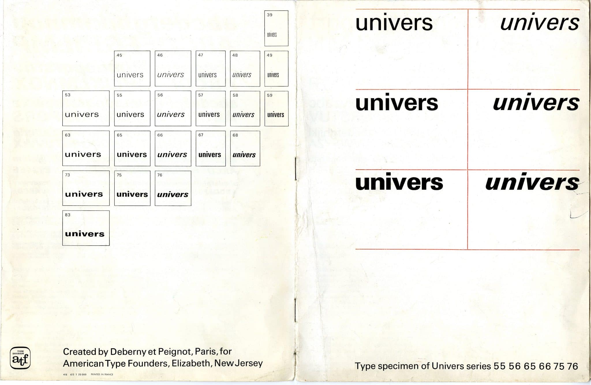
When choosing a typeface, scope should also play a role. Some typefaces exist in only one style; others include bold and italic variants. Type families may range from light to heavy, and from narrow to wide, from upright to cursive.
A project may also require small capitals, oldstyle figures, tabular figures, fractions or other OpenType features. The typeface should offer the forms that the project actually needs.
Quality
Some typefaces, whether free fonts or commercial fonts, may be of poor quality. Before choosing a typeface, it is worth checking whether the letterforms are suitable for the intended use, or whether higher-quality versions are available.
Multilingual support
Some projects require more than a basic Latin character set. Names, places and quotations may need accents, special characters or even different scripts. Before choosing a typeface, it is worth checking whether it supports all languages and characters used in the text.
Type pairing
Some typesetters prefer to use one typeface throughout a document. Others consider it plausible to combine two typefaces. For example, they might use a sans serif for headings and a serif for text, arguing that the serif is easier to read. This decision is called type pairing.
When pairing typefaces, it is usually better not to use more than two. The two typefaces should relate to each other, complement each other and create a similar level of contrast.
Superfamilies
Some typefaces are not only serif or sans serif, but combine several styles under the same formal principles. Rotis by Otl Aicher, for example, is available as serif and sans serif, as well as intermediate styles between the two.
These superfamilies can be especially useful for type pairing, because the mixture remains formally related while still offering visible differences between roles.
Emphasis
In regular text, all words sit on one level. If we change the weight of individual words, we emphasise them. If we set them in italic, we indicate a different voice or tone. In surnames, lowercase letters can be set as small capitals. Abbreviations can be set entirely in small capitals so that they do not “shout”.
Introduction
fremdschämen
Claude François
NATO
Signal
Lesson 3: precision
Characters, spacing, details
Placeholder for content on quotation marks, apostrophes, dashes, non-breaking spaces, ligatures, kerning and typographic punctuation.
Ragged & justified setting
Placeholder for content on alignment, line length, hyphenation, typographic colour, word spacing, and the difference between a clean edge and good reading text.
Repetition, pace, variation
Placeholder for content on baseline grids, vertical spacing, modules, repetition across pages and deliberate breaks within a system.
Staying consistent
Placeholder for content on detail decisions, proofreading, recurring elements, styles, exceptions and the point at which consistency becomes visible.
Supplement
Glossary
| Description | ||
|---|---|---|
| Aperture | Offene Punze | The opening in a letterform, for example in c, e or s. A wider aperture often improves readability at small sizes. |
| Apex | Scheitel | The point where two diagonal strokes meet, as in A. |
| Ascender | Oberlänge | The part of a lowercase letter that rises above the x-height, such as b, d, h or l. |
| Baseline | Grundlinie | The invisible line on which most letters sit. |
| Baseline grid | Grundlinienraster | A regular vertical grid used to align lines of type across columns and pages. |
| Bastard title | Schmutztitel | A short title page before the main title page of a book. |
| Beak | Schnabel | A small projecting stroke or terminal on some letterforms. |
| Blackletter | Gebrochene Schrift | A historical script and type category with broken, dense strokes, including Textura and Fraktur. |
| Bleed | Beschnitt | Printed area that extends beyond the trim edge so images or colour can run to the edge after cutting. |
| Block quote | Zitatblock | A longer quotation set apart from the running text, often with different spacing or indentation. |
| Book size | Brotgröße | A traditional German term for type sizes used in continuous reading text, as opposed to larger display sizes. |
| Body copy | Fließtext | The main continuous reading text of a publication. |
| Bold | Fett | A heavier weight of a typeface, often used for emphasis or hierarchy. |
| Bowl | Bauch | The curved enclosed stroke of letters such as b, d, o or p. |
| Bracket | Kehlung | The curved transition between a serif and the main stroke. |
| Calligraphy | Kalligrafie | Writing as a formal, shaped practice, often with a broad-nib or pointed pen. |
| Cap height | Versalhöhe | The height of capital letters measured from baseline to top. |
| Caption | Bildunterschrift | Text accompanying an image, diagram or table. |
| Character | Zeichen | A letter, number, punctuation mark or symbol in a writing system. |
| Character spacing | Laufweite | The overall spacing added between characters in a piece of text. |
| Character style | Zeichenformat | A saved set of formatting rules applied to selected characters or words, often used for emphasis within paragraph styles. |
| Column | Spalte | A vertical text area in a layout grid. |
| Column grid | Spaltenraster | A grid that divides the page into vertical columns for organising text and images. |
| Condensed | Schmal | A narrower width of a typeface. |
| Contrast | Strichkontrast | The difference between thick and thin strokes in a typeface. |
| Copyfitting | Texteinpassung | Adjusting text, size, spacing or layout so copy fits a defined space. |
| Counter | Punze | The enclosed or partly enclosed space inside a letterform, such as in o, e or a. |
| Crop marks | Schnittmarken | Printed marks indicating where a sheet should be trimmed. |
| Crossbar | Querbalken | A horizontal stroke connecting or crossing a letter, as in A, H or t. |
| Cursive | Kursive Schrift | A flowing, handwritten or script-like type style. |
| Dash | Strich | A punctuation mark used in ranges, interruptions or parenthetical phrases. |
| Deck | Vorspann | A short introductory text below a headline, common in editorial design. |
| Descender | Unterlänge | The part of a lowercase letter that extends below the baseline, such as g, j, p or y. |
| Display type | Schaugröße | Type intended for headlines or large sizes rather than continuous reading. |
| Drop cap | Initiale | A large opening letter dropped into the first lines of a paragraph. |
| Ear | Ohr | A small stroke projecting from a letter, often seen on lowercase g. |
| Ellipsis | Auslassungspunkte | Three dots, or a single ellipsis character, indicating omission or pause. |
| Em | Geviert | A relative unit equal to the current type size. |
| Em dash | Geviertstrich | A long dash, one em wide in principle, used differently across typographic traditions. |
| En | Halbgeviert | A relative unit equal to half an em. |
| En dash | Halbgeviertstrich | A dash often used for ranges, for example 10-12, and in some languages for parenthetical phrases. |
| Endnote | Endnote | A note placed at the end of a chapter, article or book. |
| Expanded | Breit | A wider width of a typeface. |
| Expert set | Expertensatz | A font or glyph set with specialised characters such as small caps, ligatures or oldstyle figures. |
| Family | Schriftfamilie | A group of related typefaces, usually including several weights, widths or styles. |
| Figure space | Ziffernleerzeichen | A space with the width of a figure, useful for aligning numbers. |
| Figures | Ziffern | Numerals in a typeface, often available in lining, oldstyle, tabular or proportional forms. |
| Flush left | Linksbündig | Text aligned on the left with a ragged right edge. |
| Flush right | Rechtsbündig | Text aligned on the right with a ragged left edge. |
| Folio | Seitenzahl | The page number, often part of the running header or footer. |
| Font | Font | A usable digital file or instance of a typeface. Historically, a specific size and style of metal type. |
| Footnote | Fußnote | A note placed at the bottom of a page. |
| Format | Format | The size and proportion of a page, screen or publication. |
| Foundry | Schriftgießerei | A company or workshop that designs, produces or distributes typefaces. |
| Fraktur | Fraktur | A blackletter style with broken forms and distinctive capitals, historically important in German typography. |
| Full stop | Punkt | The punctuation mark that ends a sentence in English. |
| Glyph | Glyphe | The visual form used to represent a character or part of a character. |
| Grid | Raster | An underlying structure for organising elements on a page or screen. |
| Grotesque | Grotesk | An early sans serif category with relatively plain forms and often compact proportions. |
| Gutter | Spaltenabstand / Bundsteg | The space between columns; in book design, also the inner margin near the binding. |
| Hairline | Haarlinie | A very thin stroke or rule. |
| Hanging punctuation | Hängende Interpunktion | Punctuation positioned slightly outside the text edge to create a visually cleaner alignment. |
| Headline | Überschrift | A prominent line of text introducing an article, section or topic. |
| Hierarchy | Hierarchie | The visual ordering of information by size, weight, spacing, position or contrast. |
| Hinting | Hinting | Font instructions that improve rendering at small sizes or low resolutions. |
| Humanist | Humanistisch | A type category influenced by handwriting, broad-nib contrast and open forms. |
| Hyphen | Bindestrich | A short mark used in compound words and word division. |
| Hyphenation | Silbentrennung | Dividing words at line endings to improve spacing and line breaks. |
| Imposition | Ausschießen | Arranging pages on a press sheet so they appear in the correct order after folding and trimming. |
| Indent | Einzug | A paragraph start set in from the text edge. |
| Initial | Initiale | An enlarged or decorated opening letter. |
| Ink trap | Farb- / Tintenfalle | A deliberate cut or notch in a letterform that compensates for ink spread or adds stylistic character. |
| Italic | Kursiv | A slanted, separately drawn style used for emphasis, titles or contrast. |
| Justified | Blocksatz | Text aligned to both left and right edges by adjusting spacing within lines. |
| Kerning | Kerning / Unterschneidung | Adjusting the space between specific pairs of letters. |
| Leading | Zeilenabstand | The vertical distance from one baseline to the next. |
| Letter spacing | Laufweite | Uniform spacing added between letters. |
| Ligature | Ligatur | A combined glyph replacing two or more letters, such as fi or fl. |
| Line length | Zeilenlänge | The measure of a line of text, usually important for reading comfort. |
| Lining figures | Versalziffern | Numerals with a uniform height, usually aligning with capitals. |
| Lowercase | Gemeine / Kleinbuchstaben | The smaller letterforms of the alphabet. |
| Majuscule | Majuskel | A capital letter. |
| Margin | Rand / Steg | The space between the page edge and the content area. |
| Master page | Musterseite | In InDesign, a page template used to place recurring elements such as margins, grids, page numbers or running heads across multiple document pages. |
| Measure | Satzbreite | The width of a line or text column. |
| Microtypography | Mikrotypografie | Fine typographic decisions such as spacing, punctuation, kerning and line breaks. |
| Minuscule | Minuskel | A lowercase letter. |
| Modern | Klassizistische Antiqua | A serif category with strong contrast, vertical stress and fine serifs. |
| Modular grid | Modulares Raster | A grid made from columns and rows, creating repeatable modules for layout. |
| Monospaced | Nichtproportional | A typeface in which all characters occupy the same width. |
| Non-breaking space | Geschütztes Leerzeichen | A space that prevents an unwanted line break between words or signs. |
| Oldstyle figures | Mediävalziffern | Numerals with ascenders and descenders that blend into lowercase text. |
| Optical margin alignment | Optischer Randausgleich | Adjusting punctuation or letterforms at the margin to create a cleaner visual edge. |
| Optical size | Optische Größe | A typeface design variant made for a specific size range, such as caption, text or display. |
| Orphan | Hurenkind | A short final line or paragraph fragment isolated at the top of a page or column. |
| Overshoot | Überhang | The slight extension of round or pointed letters beyond baseline or cap height to appear optically equal. |
| Page | Seite | One side of a leaf in a printed or digital document. |
| Page furniture | Kolumnenelemente | Recurring page elements such as running heads, folios, rules or notes. |
| Paragraph style | Absatzformat | A saved set of formatting rules for paragraphs. |
| Point | Punkt | A typographic unit used to measure type size and spacing. |
| Press sheet | Druckbogen | A sheet printed before folding, trimming or binding. |
| Proof | Korrekturabzug | A test output used to check text, layout, colour and production details. |
| Proportional figures | Proportionale Ziffern | Numerals with individual widths, useful in running text. |
| Pull quote | Hervorgehobenes Zitat | A selected quotation enlarged or separated to attract attention. |
| Rag | Flattersatzkante | The uneven edge of ragged text, judged by rhythm and shape. |
| Ragged right | Linksbündiger Flattersatz | Text aligned left with uneven line endings on the right. |
| Recto | Recto / rechte Seite | The right-hand page of an open book or spread. |
| Registration | Registerhaltigkeit | Alignment of printed matter, often also baseline alignment across front and back of a sheet. |
| Roman | Aufrecht | The upright style of a typeface, as opposed to italic or oblique. |
| Rule | Linie | A typographic line used to divide, emphasise or structure content. |
| Running head | Kolumnentitel | A recurring header that identifies a chapter, article or section. |
| Sans serif | Serifenlos / Grotesk | A typeface without serifs. |
| Script | Schreibschrift | A typeface category based on handwriting or calligraphic movement. |
| Section | Abschnitt | A structural part of a document or publication. |
| Serif | Serife | A small stroke attached to the end of a main stroke. |
| Set solid | Kompress gesetzt | Type set with leading equal to the type size, for example 10/10 pt. |
| Shoulder | Schulter | The curved stroke of letters such as h, m or n. |
| Side note | Marginalie | A note placed in the margin beside the main text. |
| Signature | Lage | A folded group of pages that forms part of a book block. |
| Slab serif | Serifenbetonte Linear-Antiqua | A type category with heavy, block-like serifs. |
| Small caps | Kapitälchen | Capital letterforms drawn at a smaller height, usually matching lowercase texture better than scaled capitals. |
| Soft hyphen | Bedingter Trennstrich | An invisible hyphen that appears only when a word breaks at the end of a line. |
| Spacing | Zurichtung | The designed sidebearings and spaces around glyphs in a typeface. |
| Spine | Rücken | The bound edge of a book; also a main curved stroke in some letterforms. |
| Spread | Doppelseite | Two facing pages viewed together. |
| Stem | Stamm | A main vertical or diagonal stroke of a letter. |
| Stress | Achse | The angle of contrast in curved letters, often related to writing tools. |
| Stroke | Strich | A structural line or mark that forms part of a letter. |
| Style sheet | Formatvorlage | A defined set of rules for consistent typography and layout. |
| Subhead | Zwischenüberschrift | A secondary heading inside an article or section. |
| Swash | Schwungbuchstabe | A decorative extension of a letterform. |
| Tabular figures | Tabellenziffern | Numerals with equal widths, useful for columns of numbers. |
| Tail | Schweif | A descending or projecting stroke, as in Q, y or j. |
| Terminal | Endung | The end of a stroke that is not a serif. |
| Text face | Brotschrift | A typeface designed for comfortable reading in longer text. |
| Text type | Textschrift / Leseschrift | Type designed for continuous reading, usually at smaller sizes, with forms and spacing suited to long passages of text. |
| Thin space | Schmales Leerzeichen | A narrow space used in fine spacing, for example around certain punctuation or units. |
| Tracking | Laufweite | Uniform adjustment of spacing across a selected range of text. |
| Transitional | Übergangsantiqua | A serif category between oldstyle and modern, with increased contrast and more vertical stress. |
| Trim size | Endformat | The final size of a printed piece after trimming. |
| Typeface | Schrift / Schriftart | The design of a set of letterforms, distinct from the font file that implements it. |
| Typographic colour | Grauwert | The overall tonal density of a text block created by type size, weight, spacing and leading. |
| Uppercase | Versalien / Großbuchstaben | Capital letters. |
| Variable font | Variable Font | A font format that allows continuous variation along axes such as weight, width or optical size. |
| Verso | Verso / linke Seite | The left-hand page of an open book or spread. |
| Weight | Schriftstärke | The thickness of strokes in a typeface, such as light, regular, bold or black. |
| White space | Weißraum | The empty or unprinted space that shapes hierarchy, rhythm and focus. |
| Widow | Schusterjunge | A short final line of a paragraph left isolated at the bottom of a page or column. |
| Word spacing | Wortabstand | The space between words, crucial for justified and readable text. |
| X-height | x-Höhe / Mittellänge | The height of lowercase letters without ascenders or descenders, measured by x. |